참고 사이트 : https://themewagon.github.io/ogani/index.html
오늘 공부한 내용
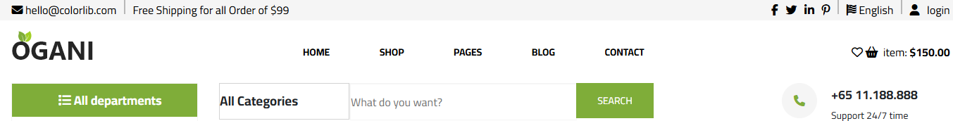

상단 네비게이션, 검색창, 전화번호, 좌측 카테고리 영역 css적용
코드
<!-- 로고, 네비게이션파트 -->
<nav>
<div class="header_part">
<!-- 로고 -->
<div>
</div>
<!-- 로고 끝 -->
<!-- 네비게이션 시작 -->
<div class="navi">
<span><a href="#">PAGES</a></span>
</div>
<!-- 네비게이션 끝 -->
네비게이션 파트 html
.header_part {
width: 70%;
margin: 0 auto;
display: flex;
justify-content: space-between;
align-items: center;
}
.navi {
display: flex;
width: 555px;
height: 79px;
padding: 5px 0;
font-size: 14px;
justify-content: space-around;
font-weight: bold;
align-items: center;
}
.navi:hover {
color: #7FAD39;
}
네비게이션 CSS
<!-- 네비게이션 카테고리 파트 시작 -->
<div class="nav_hero">
<div class="cate_cont">
<nav class="category">
<div class="list">
<i class="fa-solid fa-list"></i> <b>All departments</b>
</div>
<div class="left_cat">
<ul>
<li><a href="#">Fresh Meat</a></li>
<li><a href="#">Vegetables</a></li>
<li><a href="#">Fruits & Nut Gifts</a></li>
<li><a href="#">Fresh Berries</a></li>
<li><a href="#">Ocean Foods</a></li>
<li><a href="#">Butter & Eggs</a></li>
<li><a href="#">Fastfood</a></li>
<li><a href="#">Fresh Onion</a></li>
<li><a href="#">Papaya & Crisps</a></li>
<li><a href="#">Oatmeal</a></li>
<li><a href="#">Fresh Bananas</a></li>
</ul>
</div>
</div>
</nav>
<!-- 네비게이션 카테고리 파트 끝 -->
좌측 카테고리 부분 html
/* 카테고리 */
.list {
display: block;
height: 27px;
text-align: center;
line-height: 27px;
background-color: #7FAD39;
color: white;
padding: 10px 25px 10px 40px;
font-size: 18px;
}
.cate_cont {
display: flex;
max-width: 25%;
}
nav.category {
width: 262.5px;
height: 500px;
border: 1px solid #f5f5f5;
}
.left_cat {
text-align: left;
padding-left: 42px;
line-height: 2.5;
}
카테고리 css
<!-- 메인배너, 검색창, 전화번호 파트 -->
<div class="hero">
<div class="ser_tel">
<!-- 검색창 -->
<div class="search">
<div class="ser_cat">
<h3>All Categories</h3>
</div>
<div class="searchbox">
<input type="text" placeholder="What do you want?">
</div>
<div class="search_submit">
<button type="button">SEARCH</button>
</div>
</div>
<!-- 전화번호 -->
<div class="tel">
<div class="phone"><i class="fa-solid fa-phone"></i>
</div>
<div class="tel_num">
<span>+65 11.188.888</span>
<p>Support 24/7 time</p>
</div>
</div>
</div>
검색창, 전화번호 파트 html
/* 메인배너 */
.hero {
display: flex;
width: 75%;
min-width: 75%;
/* background-color: lightgreen; */
color: #212529;
flex-direction: column;
}
.nav_hero {
display: flex;
gap: 30px;
width: 70%;
margin: 0 auto;
}
.search {
display: flex;
font-size: 16px;
}
div.ser_tel {
display: flex;
justify-content: space-between;
}
.ser_cat {
display: flex;
width: 183px;
height: 50px;
background-color: white;
line-height: 50px;
border: 1px solid lightgray;
}
.searchbox {
width: 320px;
height: 50px;
border: #f5f5f5 1px solid;
}
.searchbox input {
display: flex;
height: 50px;
width: 320px;
border: 1px #f5f5f5 solid;
font-size: 16px;
}
.search_submit button{
border: none;
width: 110px;
height: 50px;
color: white;
font-size: 14px;
background-color: #7FAD39;
cursor: pointer;
}
.tel {
display: flex;
}
.phone {
width: 50px;
height: 50px;
background-color: #f5f5f5;
text-align: center;
line-height: 50px;
color: #7FAD39;
border-radius: 50%;
}
.tel_num {
display: inline-block;
width: 130px;
padding-left: 20px;
}
.tel_num span {
font-weight: 900 ;
font-size: 18px;
}
.tel_num p {
font-size: 14px;
}
검색창, 전화번호 파트 css
공부중 겪은 문제점 : 좌측 네비게이션 블럭과 우측 메인배너 블럭 좌우배치 후 우측 상단부터 가로로 나눠서 검색창, 전화번호 넣기 div로 구분하는게 잘 안됐었고, css 적용할때 생각보다 애를 먹음
'프로그래밍 공부' 카테고리의 다른 글
| 2024.11.28 클론코딩 공부(내용) (2) | 2024.11.29 |
|---|---|
| 2024.11.27 클론코딩 공부(내용) (0) | 2024.11.27 |
| 2024.11.25 CSS3 공부 (0) | 2024.11.25 |
| 2024.11.22 CSS3 공부 (0) | 2024.11.22 |
| 2024.11.21 CSS3 공부 (0) | 2024.11.21 |